What We Learned

Cognitive Overload
Information existed, but users couldn’t find it when they needed it.

Conversations Were Non-Linear
Patient needs shifted quickly across topics, tasks, and documentation.

Workarounds Were Everywhere
Paper notes, memory, and unofficial tool use filled system gaps.
Designing Around Real Work
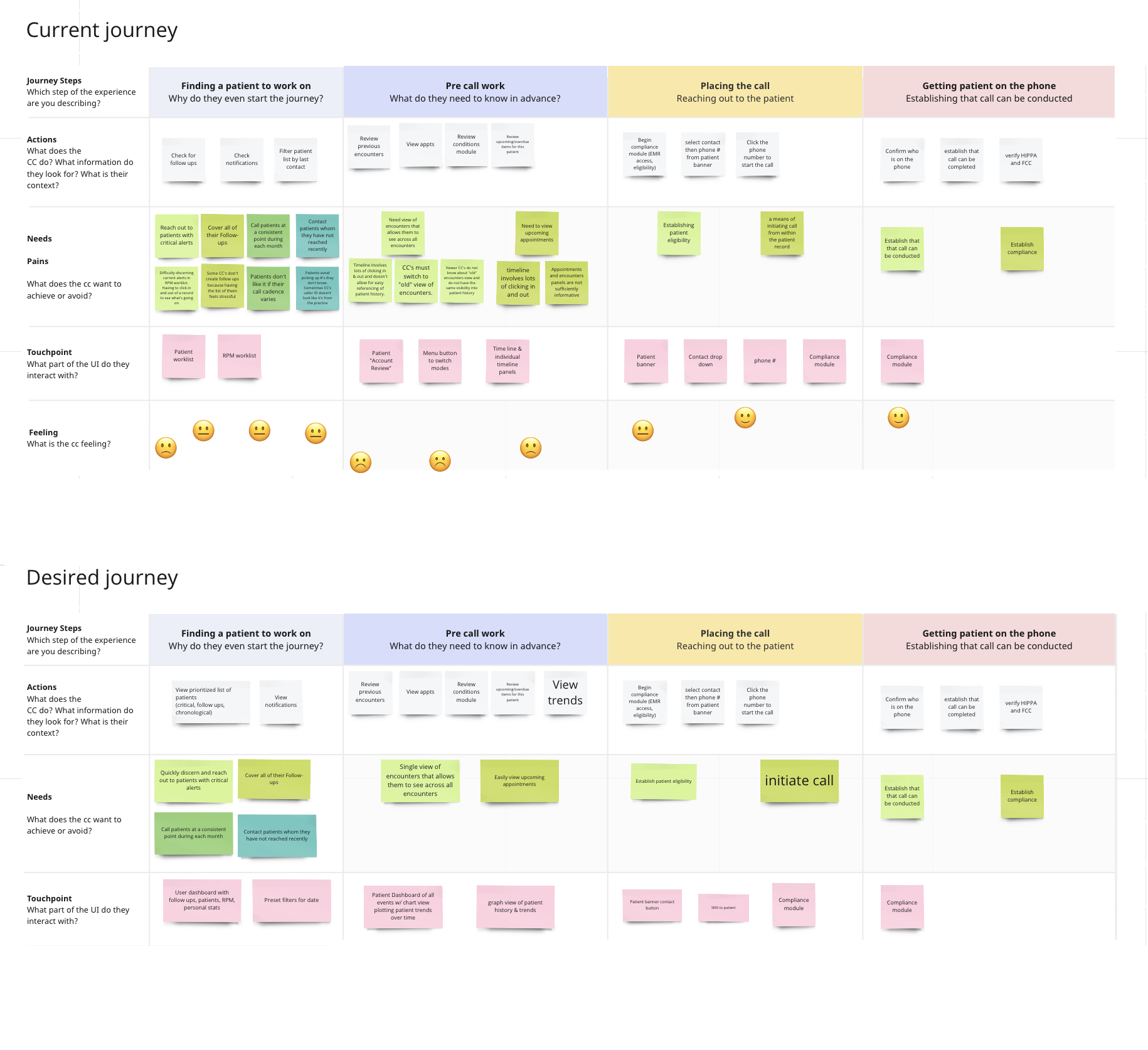
Workflow Mapping
Mapped care coordinators’ calls to identify confusion, redundant actions, and moments where users lost context.
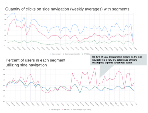
Behavioral Validation
Used FullStory click data and follow-up interviews to find where repetitive scrolling and underused features were slowing work down.
Prototype Testing
Tested realistic interaction models before build, validating new flows and surfacing usability issues early.
Designed for Real Conversations
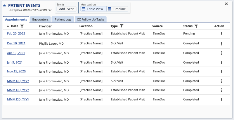
Event Manager
Problem: Timeline views made patient history difficult to scan.
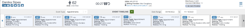
Solution: Replaced timelines with glanceable summaries that surfaced key events.
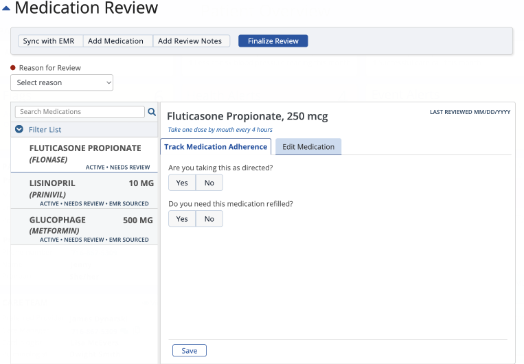
Medication Manager
Problem: Medication adherence and dosage management were tangled together.
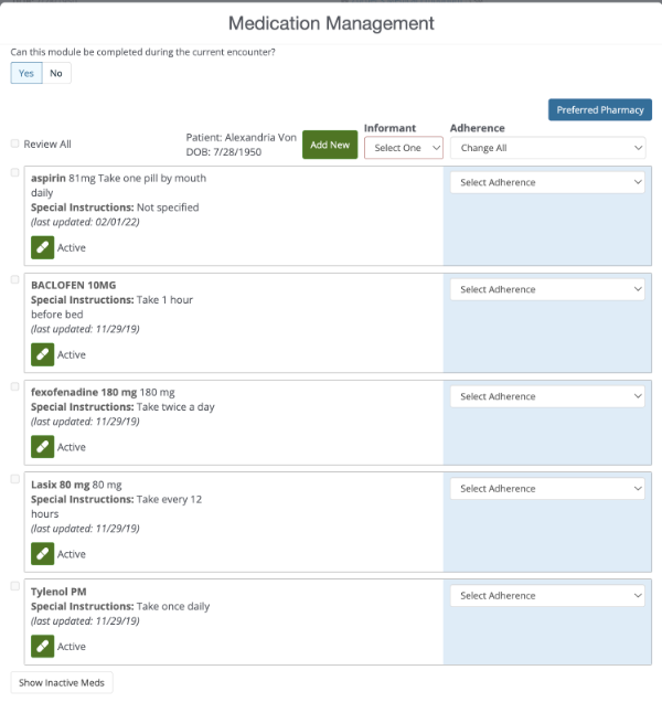
Solution: Separated workflows and added searchable navigation for faster review..
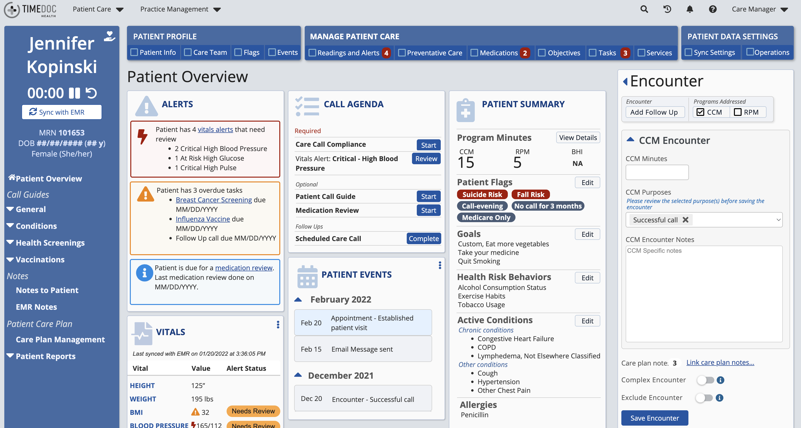
Patient Record Dashboard
Problem: Critical information was scattered across the interface.
Solution: Brought priorities, alerts, and actions into a single overview.

Impact
- Accessibility addressed: Redesigned workflows to support visual and motor impairments, ensuring usability across diverse user needs in a high-volume environment.
- Efficiency gained: Reduced call time by ~5 minutes per interaction, enabling each coordinator to support at least two additional patients daily.
- Usability uplifted: SUS scores increased consistently across redesigned features, reflecting clearer navigation and reduced cognitive load.
- User trust rebuilt: Coordinators described updates as “what I’ve been asking for for years,” signaling stronger alignment between the system and real-world needs